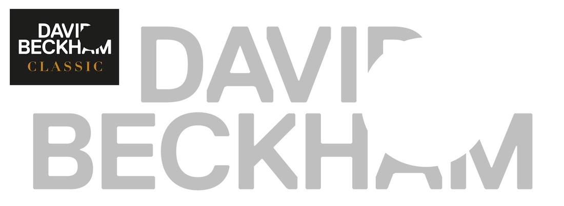
Above is the logo in which is used for the David Beckham brand. I personally find it an interesting piece of typography as it shows a strong relationship between the name of the person, and the profession in which they have.
David Beckham is one of the Worlds most famous footballers of the recent past. His name is so widely known, that his name is easily recognisable when some of the letters have been distorted. The letters have been cut, to suggest a large circle shape within the text. which relates to a football. By doing this, I feel that it leaves some of the work to the viewer's imagination, so the piece creates a stronger relationship with the audience.
David Beckham is one of the Worlds most famous footballers of the recent past. His name is so widely known, that his name is easily recognisable when some of the letters have been distorted. The letters have been cut, to suggest a large circle shape within the text. which relates to a football. By doing this, I feel that it leaves some of the work to the viewer's imagination, so the piece creates a stronger relationship with the audience.

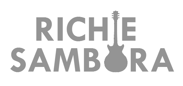
I wanted to play with this same technique but using a different name, so I have chosen Richie Sambora, who is one of the world's greatest guitarists and song writers. His name is less well known than David Beckham's, so when creating my piece I had to make sure that each letter could still be easily identified.
Above is my first design in which I have cut the letters in a way which suggests the Profession of the person. I believe that each letter is still readable and that a shape of a guitar can be identified even though the shape is incomplete. I feel that I have made effective use of the curvature of the letter "C" to cater for the shape of the guitar.
This is only my first experiment, and to improve it, I feel as thought I could create a much more stronger piece, I find a way of connecting the two names, so that they appear as one.
 When looking at the name, I saw that both the "I" and the "O" within the name could easily form a guitar. So this time, instead of cutting shapes into my letters, I decided to use shapes that act like letters within the text. As the guitar shape created the two letters within the name, it forms a stronger relatioship between the first and second name, just like the David Beckham when the letter was cut in each row of text. I think my design gives a strong message to the viewer that this is the name of one man, rather than two separate names. | 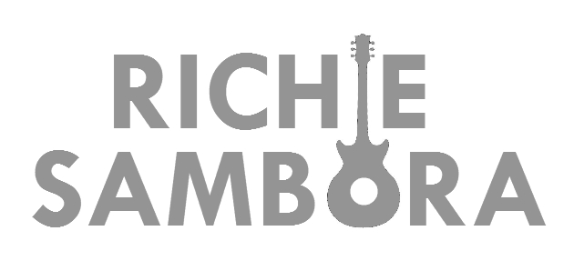 This is the same design as the previous but with one slight alteration. I added a white circle within my guitar shape, which not only helps create the shape of an acoustic guitar, it also creates the Inner circle within the Letter "O". Personally I feel that this could be a bit to obvious and leaves nothing to the viewers imagination, but I created it just to show that it could be done in case a viewer prefers a more obvious design. |
Vlandirmir Script
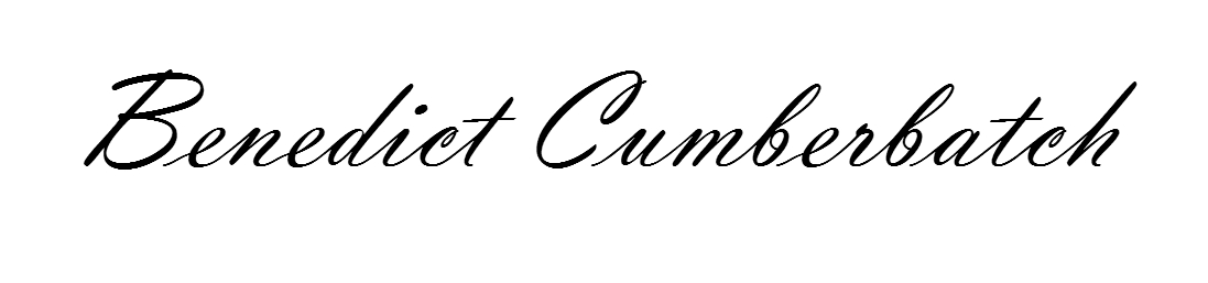
Benedict Cumberbatch is an famous well spoken English actor, so it was important to find a font that best described this. I have chosen "Vlanderimir Script" as I believe its it has that, English glamour feel to it, without overworking the text. The font has a perfect amount of exaggerated swirls in the lettering that it conveys an elegant handwritten effect but it is still easily to read for the audience.
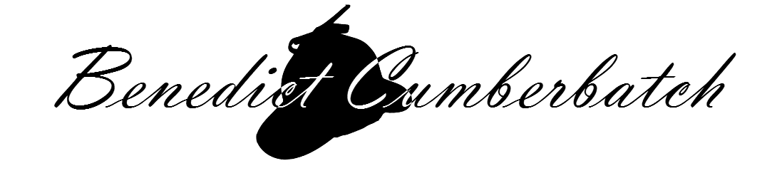
The actor himself is most famously known for his role in the BBC production of "Sherlock". I felt that by including a shape into the text, which relates to a costume or prop that his character often uses within the programme, the shape could form a strong relationship with the language of the text. It also makes the actors name more identifiable.
The shape of the hat has been added within the centre of the text which creates a stronger connection between the two names, however this does create an almost central composition. It also disrupts the flow in which you red the text.
The shape of the hat has been added within the centre of the text which creates a stronger connection between the two names, however this does create an almost central composition. It also disrupts the flow in which you red the text.
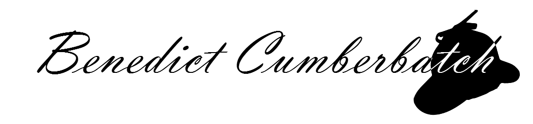
With this design, the hat shape has been located to that end of the wording. I feel that this is much more effective as it does not disturb the name, and it creates a much more unbalanced and interesting composition. It also acts a type of clue, to give to the viewer at the end of the name, in case the name wasn't obvious to them on its own.
