Positive aspects about my designs
Suitable colours
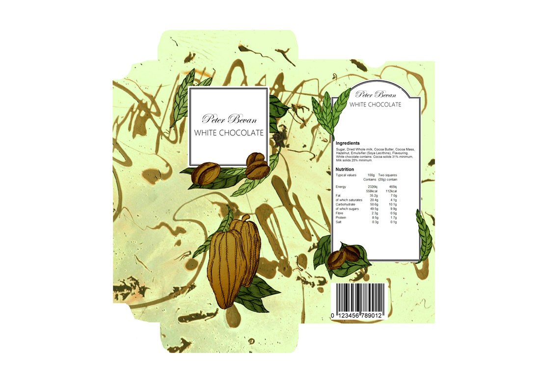
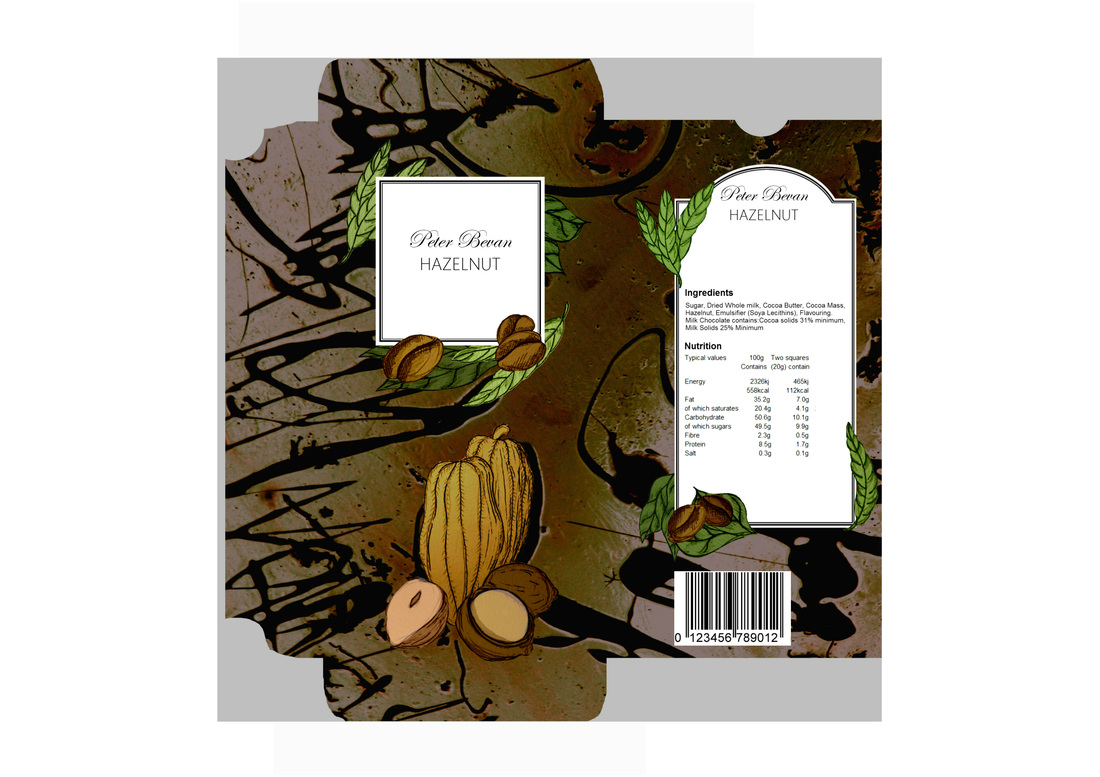
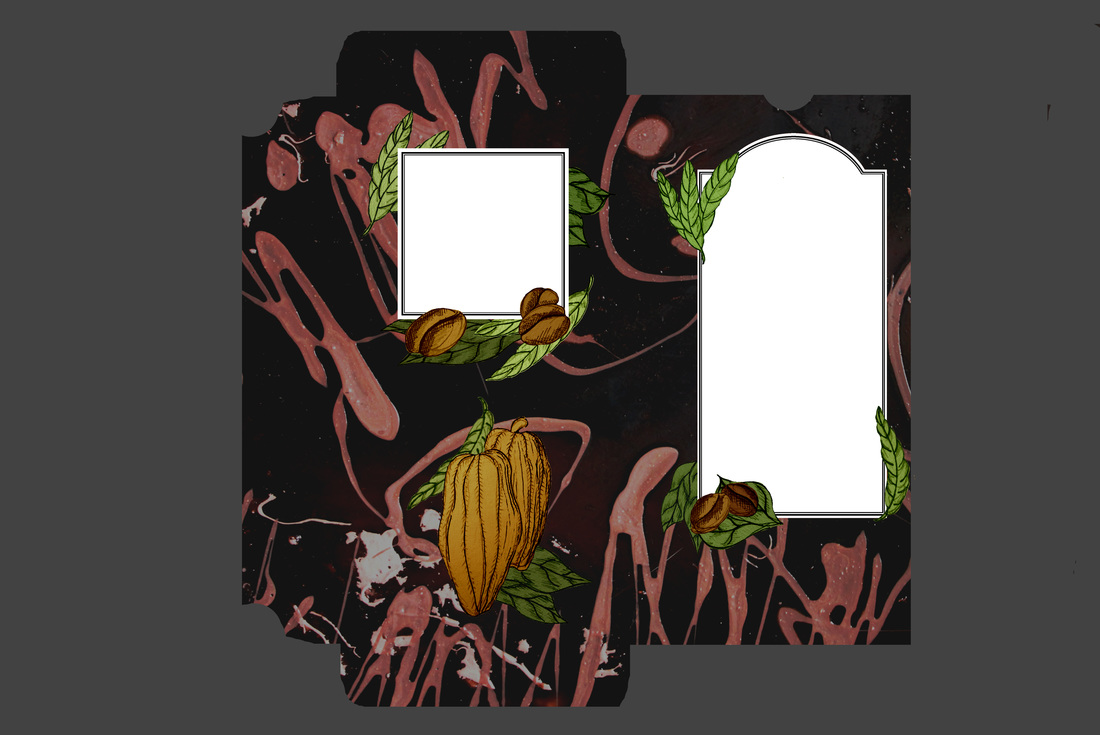
The dominant colour of a packaging, is usually the very first thing a customer notices when first viewing the product. As I have a variety of designs suitable to a range of different flavours, it is important that the dominant colour used in each design relates to the flavour of the product. By doing this, I create a stronger visual understanding between my packaging and the customer.
Personal thought
I feel that I have done this successfully as each of my packaging designs appear unique to each other as they display their own personal colour theme. I believe that the designs would work as a collection in the market as the colours help direct the customer into viewing the flavour they are looking for. Looking back, I wish I had tome to include a caramel flavour to my designs, as I feel the collection is missing a strong caramel brown design. I feel that this colour is unique when compared to the others and I have missed the opportunity to display it within my collection.
Complementing design
I find that the drawings which feature upon the packaging strongly complements the photographic background of the design. They both contrast each other in a way that they become more noticeable. They also use similar tamed colours so they appear well suited.
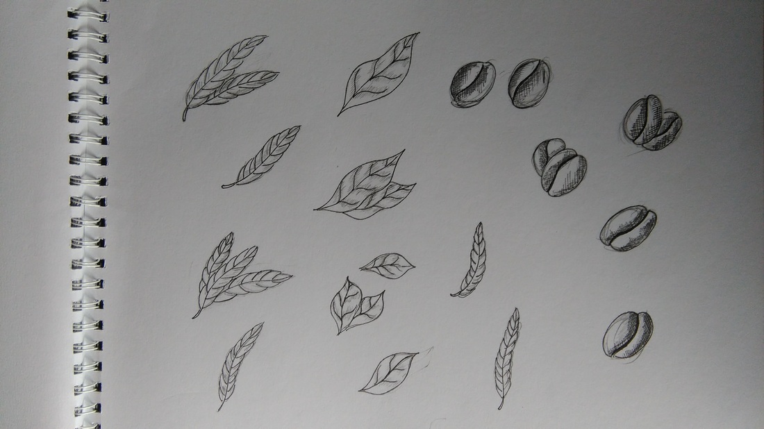
Relevant drawings
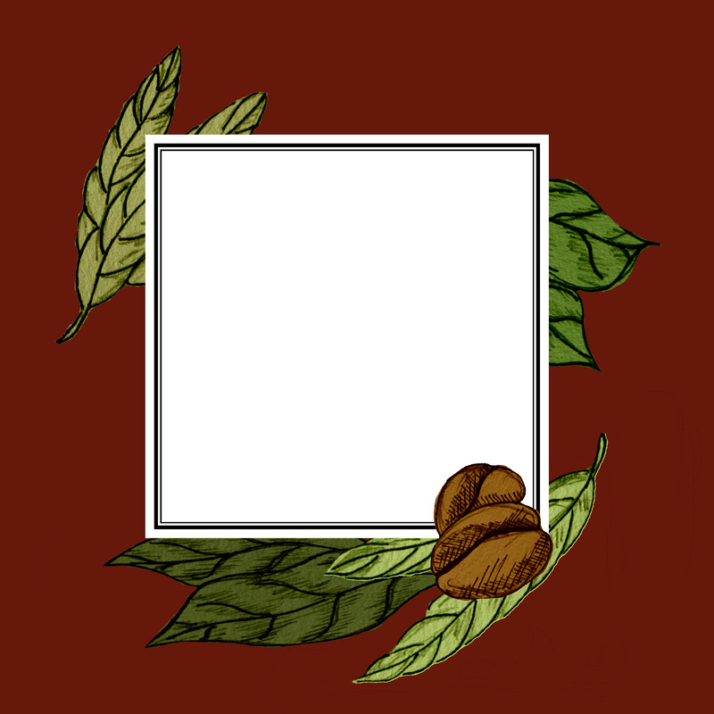
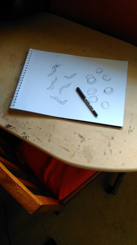
I have purposely added drawings to my designs which are specifically suitable to each flavour. By doing this I create a stronger visual language for the customer so they do not have to read the name of the product.
Personal thought
I personally feel that I have made a couple of my packaging designs more distinguishable by adding a drawing to them which is unique to that packaging only. Although, I do feel that I could have done this for all of the designs, to create an even stronger communication to the audience. If I were to create this project again I would add unique drawings on each my "White", "Milk" and "Dark" designs so that they appear less alike.
Other relation to the product
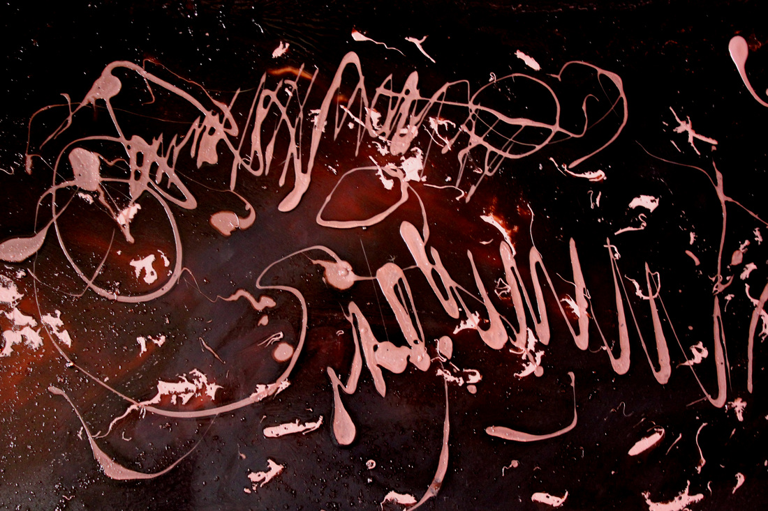
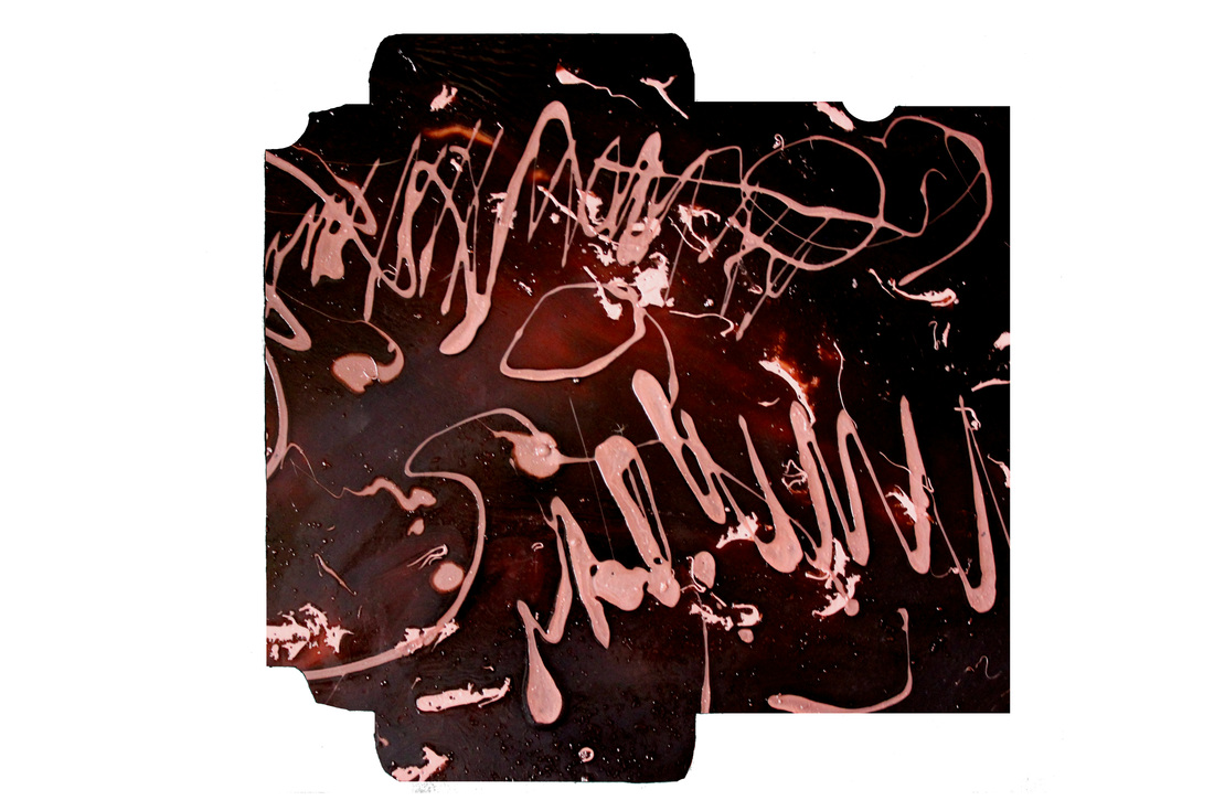
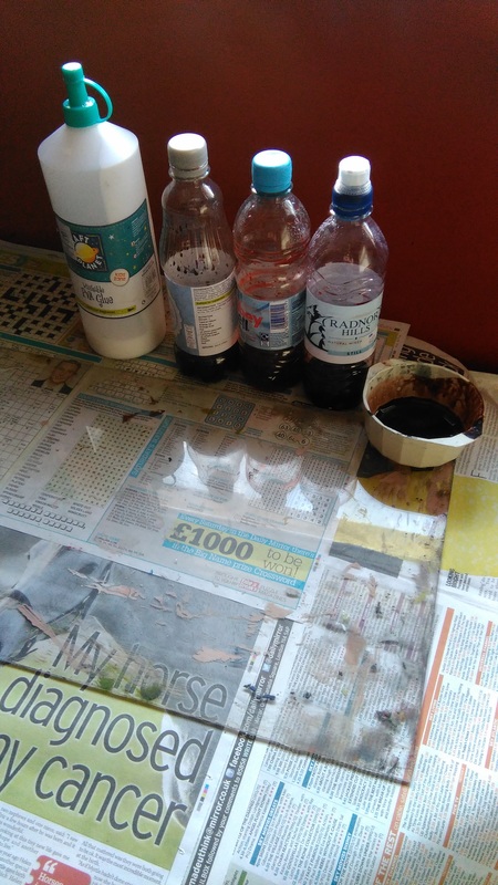
It is important that my designs instantly display to the customer that this is a chocolate product, so I have purposely used a photographic image for the backdrop of my design that contains strong chocolate like qualities within its colour and shape. These images are in fact taken from photographs of PVA glue, which I have digitally manipulated so that it appears to look like an edible chocolate mix.
Personal thought
I feel that there are such strong similarities between my PVA glue designs and real chocolate, that my designs are no longer identified as being glue, but instead, seen by my audience as the sweet luxury item that I am trying to sell.
If I was to do the project again, I would still use this same technique because it works so effectively. With this in mind, I would have like to of created many more glue designs so that more interesting shape and lines could appear in my final designs.
Relation to farmers
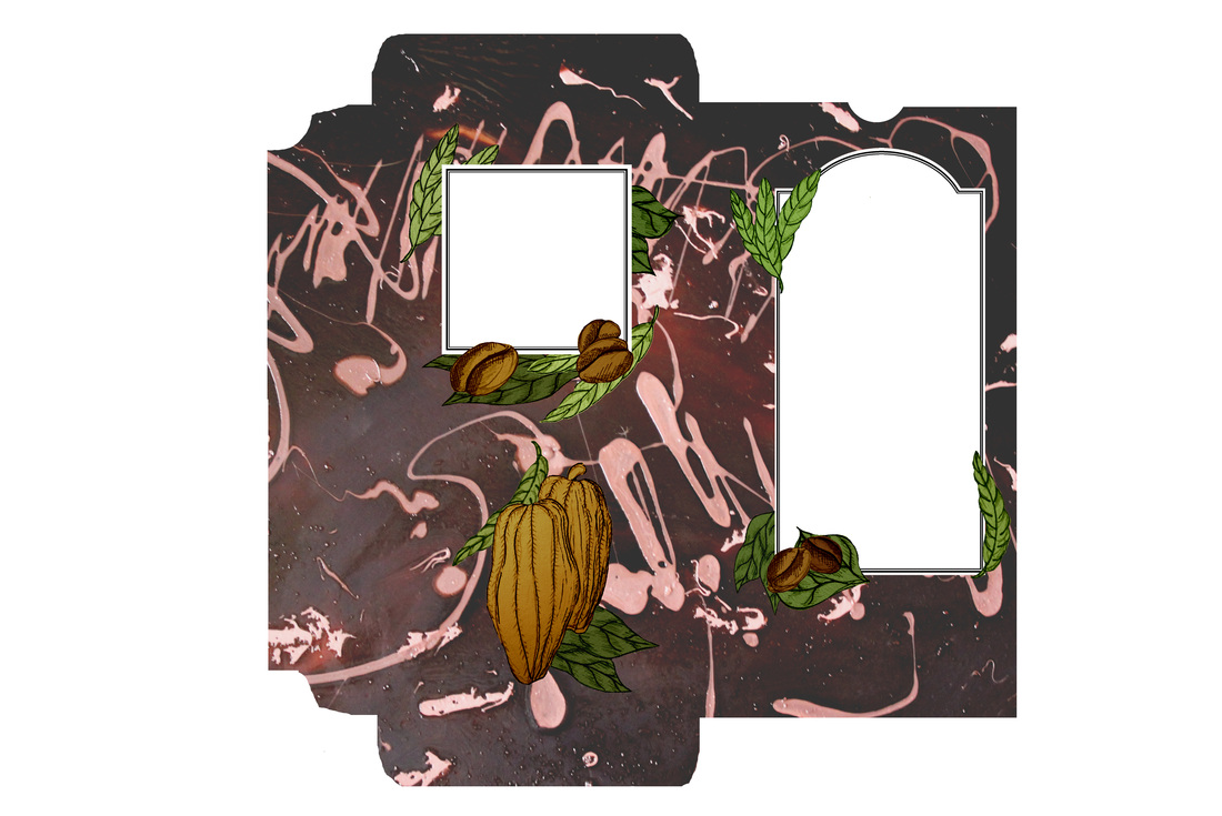
After my research, I decided that I wanted to create a design for a chocolate packaging that appears to strongly care about cocoa farmers. By including drawings of the natural plants and ingredients which go into the making of a chocolate product, I remind the customer of the journey which goes into making a chocolate item.
Easy to read text
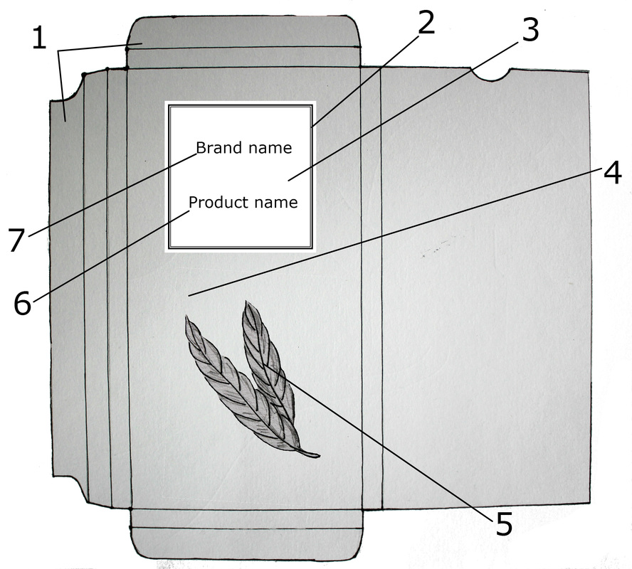
It is important to me that the name of my product is easily noticeable and readable so I have displayed the text in a black font within a white box. The white box separates the font away from the rest of the design and creates an immediate focal point upon the packaging.
Personal thought
I have thought through whether I would display my font in any other colour if I was to repeat this project, and I have decided that this would have a negative impact upon the design. I personally feel that If I was to use a colour for the font which appears similar to the colour theme of the packaging then the font would not appear very distinguished upon the design. If I was to use a font completely different from the colour theme of the packaging, then the colour could confuse the customer as it may not be suitable for a chocolate design. This is why a black font works best, as it is neutral and easily distinguishable.
Frame
Within my research for the study, I noticed that many packaging designs use a very slim black line to create a frame around the product's title. This gave their product an elegant appearance, so I have included a similar frame within my design to create the sense that this is a high quality product.
Font
I have displayed the brand of my chocolate in a separate font to the text describing its flavour, as it helps prevent confusion for the customer.
I have displayed the brand name of my chocolate in a font that appears hand written in order to create a personal touch and a sense of heritage to the text.
The flavour of each design has been displayed in a completely different text as I felt it needed to be easy to read for the customer. This is why I have chosen a font that appears basic, but still uses a thin line in order to match the elegant frame that surrounds it.
Composition
In my research I noticed that a majority of chocolate packaging follows a traditional portrait rectangular shape within its structure. I also noticed that they choose to display their product title within the top half of the design. In order to prevent confusion for my customer I felt that I should also display my title within this composition as the customer will be automatically expecting to see this information upon the top half area of my design.
I feel that the overall look of the composition of my design appears smart and presentable so it would work perfectly upon the shelves of a super market. This being said, It didn't give me much opportunity to experiment, and play, so I f I was to repeat this project I feel that I should branch out into using less traditional compositions. By doing this, I may have to change the entire target audience of my designs to a much younger audience as more experimental and expressive designs may appear less mature.
Line
I believe that I have included a variety of very different line within my packaging which creates a strong contrast for the design. For example the thick expressionistic line used in the backdrop contrasts with the more controlled thin lines used in the design’s framing and drawings.
Depth
I used digital layering so I could create a strong depth within my designs. I have also positioned my drawings so that they situate slightly behind the frame of my design, as it forces the viewer to identify and complete the image in their minds. It also makes the designs appear slightly more complex.
Suitable colours
The dominant colour of a packaging, is usually the very first thing a customer notices when first viewing the product. As I have a variety of designs suitable to a range of different flavours, it is important that the dominant colour used in each design relates to the flavour of the product. By doing this, I create a stronger visual understanding between my packaging and the customer.
Personal thought
I feel that I have done this successfully as each of my packaging designs appear unique to each other as they display their own personal colour theme. I believe that the designs would work as a collection in the market as the colours help direct the customer into viewing the flavour they are looking for. Looking back, I wish I had tome to include a caramel flavour to my designs, as I feel the collection is missing a strong caramel brown design. I feel that this colour is unique when compared to the others and I have missed the opportunity to display it within my collection.
Complementing design
I find that the drawings which feature upon the packaging strongly complements the photographic background of the design. They both contrast each other in a way that they become more noticeable. They also use similar tamed colours so they appear well suited.
Relevant drawings
I have purposely added drawings to my designs which are specifically suitable to each flavour. By doing this I create a stronger visual language for the customer so they do not have to read the name of the product.
Personal thought
I personally feel that I have made a couple of my packaging designs more distinguishable by adding a drawing to them which is unique to that packaging only. Although, I do feel that I could have done this for all of the designs, to create an even stronger communication to the audience. If I were to create this project again I would add unique drawings on each my "White", "Milk" and "Dark" designs so that they appear less alike.
Other relation to the product
It is important that my designs instantly display to the customer that this is a chocolate product, so I have purposely used a photographic image for the backdrop of my design that contains strong chocolate like qualities within its colour and shape. These images are in fact taken from photographs of PVA glue, which I have digitally manipulated so that it appears to look like an edible chocolate mix.
Personal thought
I feel that there are such strong similarities between my PVA glue designs and real chocolate, that my designs are no longer identified as being glue, but instead, seen by my audience as the sweet luxury item that I am trying to sell.
If I was to do the project again, I would still use this same technique because it works so effectively. With this in mind, I would have like to of created many more glue designs so that more interesting shape and lines could appear in my final designs.
Relation to farmers
After my research, I decided that I wanted to create a design for a chocolate packaging that appears to strongly care about cocoa farmers. By including drawings of the natural plants and ingredients which go into the making of a chocolate product, I remind the customer of the journey which goes into making a chocolate item.
Easy to read text
It is important to me that the name of my product is easily noticeable and readable so I have displayed the text in a black font within a white box. The white box separates the font away from the rest of the design and creates an immediate focal point upon the packaging.
Personal thought
I have thought through whether I would display my font in any other colour if I was to repeat this project, and I have decided that this would have a negative impact upon the design. I personally feel that If I was to use a colour for the font which appears similar to the colour theme of the packaging then the font would not appear very distinguished upon the design. If I was to use a font completely different from the colour theme of the packaging, then the colour could confuse the customer as it may not be suitable for a chocolate design. This is why a black font works best, as it is neutral and easily distinguishable.
Frame
Within my research for the study, I noticed that many packaging designs use a very slim black line to create a frame around the product's title. This gave their product an elegant appearance, so I have included a similar frame within my design to create the sense that this is a high quality product.
Font
I have displayed the brand of my chocolate in a separate font to the text describing its flavour, as it helps prevent confusion for the customer.
I have displayed the brand name of my chocolate in a font that appears hand written in order to create a personal touch and a sense of heritage to the text.
The flavour of each design has been displayed in a completely different text as I felt it needed to be easy to read for the customer. This is why I have chosen a font that appears basic, but still uses a thin line in order to match the elegant frame that surrounds it.
Composition
In my research I noticed that a majority of chocolate packaging follows a traditional portrait rectangular shape within its structure. I also noticed that they choose to display their product title within the top half of the design. In order to prevent confusion for my customer I felt that I should also display my title within this composition as the customer will be automatically expecting to see this information upon the top half area of my design.
I feel that the overall look of the composition of my design appears smart and presentable so it would work perfectly upon the shelves of a super market. This being said, It didn't give me much opportunity to experiment, and play, so I f I was to repeat this project I feel that I should branch out into using less traditional compositions. By doing this, I may have to change the entire target audience of my designs to a much younger audience as more experimental and expressive designs may appear less mature.
Line
I believe that I have included a variety of very different line within my packaging which creates a strong contrast for the design. For example the thick expressionistic line used in the backdrop contrasts with the more controlled thin lines used in the design’s framing and drawings.
Depth
I used digital layering so I could create a strong depth within my designs. I have also positioned my drawings so that they situate slightly behind the frame of my design, as it forces the viewer to identify and complete the image in their minds. It also makes the designs appear slightly more complex.
Negative aspects about my designs
Shape
All my designs are based on one template, however if I had more time on the project I would of liked to experiment with a variety of packaging structures. For example, I would be interested in creating a surface design for a selection box.
Personal thought
I feel that because all my designs use the same structure, they work very strongly as a collection. However, if I was to branch out and create a selection of designs for multiple cardboard structures I feel that this variety would allow me to be much more experimental and would give me the chance to play.
More detailed drawings
The drawings that feature on my designs are simple because I wanted them to appear distinctive upon the design's complex background. If I was to repeat this project, I would like to have tried the opposite and spend time on drawing high detailed images that would then be placed upon simple background. This would run the risk of destroying the matching set, but it could add some variety to the selection.
Branch out to multiple audiences
With its tamed selection of colours, and its use of elegant line, I feel that my designs aim at a mature audience. If I had more time on this project, I would have enjoyed creating and adding a collection of surface designs that would appeal to a young/ child audience. To do this, I would have designed packaging for more complex flavours, and introduced bright colours and characters into my designs.
The backgrounds
The backgrounds to my designs have been created using photographs of a mixture of PVA glue and dye. The problem with this was that I didn't have enough time or resources to create many pieces. In order to work around this problem, I digitally manipulated a single photograph multiple times so that I could incorporate it to the packaging of a number of flavours. If I had more time and resources I would have created more pieces, in order to allow my designs to contain a larger variety of shape and texture.
Incorporate maps into the design
I believe that it is important to be reminded of who and where grows the ingredients of our chocolate so that we can choose to support cocoa farmers across the world. I have attempted this by incorporating drawings of cocoa pods and beans into my designs, however I personally believe I could of enforced a more powerful message to my audience. If I was to repeat this project, I would like to include maps into my deigns, which display the counties which grow and provide these ingredients. This would send out a strong message of the long journey and process it takes to create this chocolate item.


 RSS Feed
