I wanted to study autographs as I believe they are a strong source for expressive Typography, however it is important to note, that an autograph is different to a signature.
A signature is a very personal way of writing your name as we use it for a sense of security in this day and age. However an autograph is an example of writing your name in which you share with world. It is supposed to be your own expressive piece, which defines yourself.
A signature is a very personal way of writing your name as we use it for a sense of security in this day and age. However an autograph is an example of writing your name in which you share with world. It is supposed to be your own expressive piece, which defines yourself.

A range of Autographs by Anna Bevan
Above is a selection of autograph designs of my sister's, in which I have displayed so that I could study and discover on what key elements create a strong effective autograph.
By studying these autographs, I immediately see that the strongest autographs are the ones which follow the norm by beginning the first letter of the name in capitals, followed by the rest of the name in lower case. They appear strongest as they are the standard way in which we write our own names, so they do not appear unusual to us. "Autograph 8" is an example of an autograph that does not start with a capital, and it lacks power and stature.
By studying these autographs, I immediately see that the strongest autographs are the ones which follow the norm by beginning the first letter of the name in capitals, followed by the rest of the name in lower case. They appear strongest as they are the standard way in which we write our own names, so they do not appear unusual to us. "Autograph 8" is an example of an autograph that does not start with a capital, and it lacks power and stature.
| This is another creation of Autograph 1, from the previous variety of designs. Personally, I believe that this design is one of the strongest with the selection as it possesses a number of key qualities. The capital letter "A" which starts the name, shows a great amount of expression and energy. This creates a strong contrast with the simple and delicate letter "n" which follows it. The capital "B" which starts the second name is much larger than the rest of the letters, which creates interesting variety in scale. Its exaggerated shape appears eye catching to the viewer. The autograph is also easy to read and can be understood so it connects well with a viewer. | 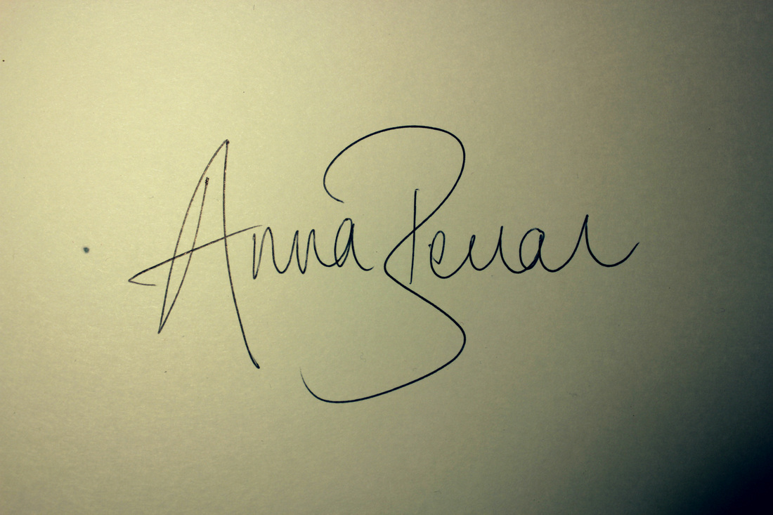 Design 1 |
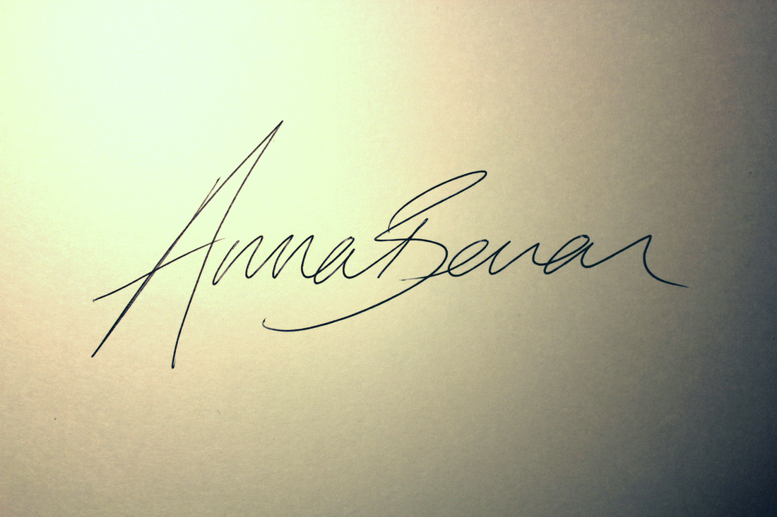 Design 2 | This is the design I find most interesting out of the selection. It is a repeat of "Autograph 11". I personally am drawn to this typography as it feels full of energy and movement. The lettering appears slightly italic, which gives it a fluent nature when reading. The largest letter of the writing is situated at the start, so it appears unbalanced within its composition. If the letter "B" was the largest, like the previous autograph, the composition would appear with dull, more central composition. The points of the letters appear sharp and distinguished, which gives the piece an eye catching quality. |
My Autgraphs
After studying these, I thought it was time to create my own autograph that would convey my own personality into the typography. Below are a display of my practise examples, which I used to develop and compare my autographs.
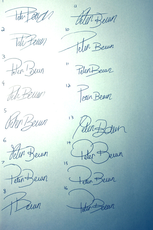 | 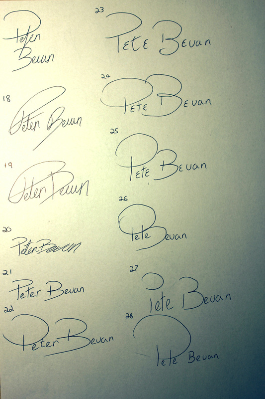 |
I feel as though within my experiments, I have shown progress. The first two Autographs, (1 and 2) appear untidy meaning it lacks connection with my viewers as they are unable to read it. Autograph 10 and 11, are much more easier to read so the viewers understanding is not restricted. By the time got to signature 22, I really felt as though I had established an effective way of drawing a capital "P", as I think it offers a distinct shape within the name, unlike example 6, when the letter "P" seems to get tangled within the other lettering. Experiment 6 and 9 showed experimentation with the letter "t", by exaggerating its shape, however I eventually scrapped it as I felt it overpowered the Autograph.
| This was was one of my first designs in which I created and I feel as though it works has a range of effective qualities. I personally find the way the capital "P" Crosses the lower case "t", an effective way in joining the lettering, as it is unconventional so it becomes unusual to the viewer. I also feel as though the capital "B" possesses a firm shape and creates a larger scale into the writing which creates variety. The dramatic underline of the autograph gives the writing an expressionistic quality. I feel that some of the lettering could be less dramatic and more content as the autographed feels a little over worked due to the exaggerated letters. | 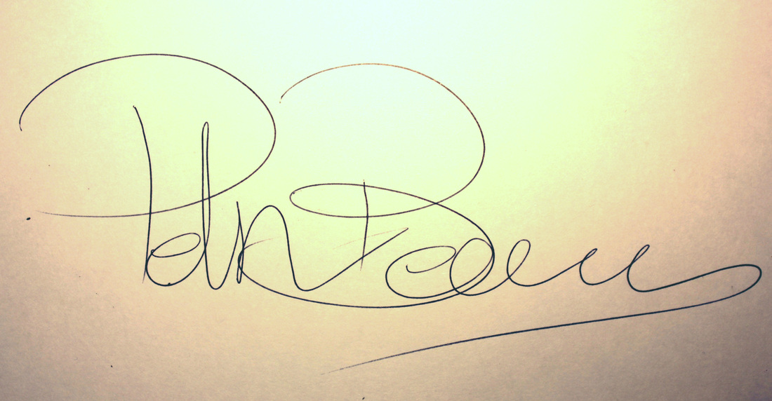 My own personal Autograph |
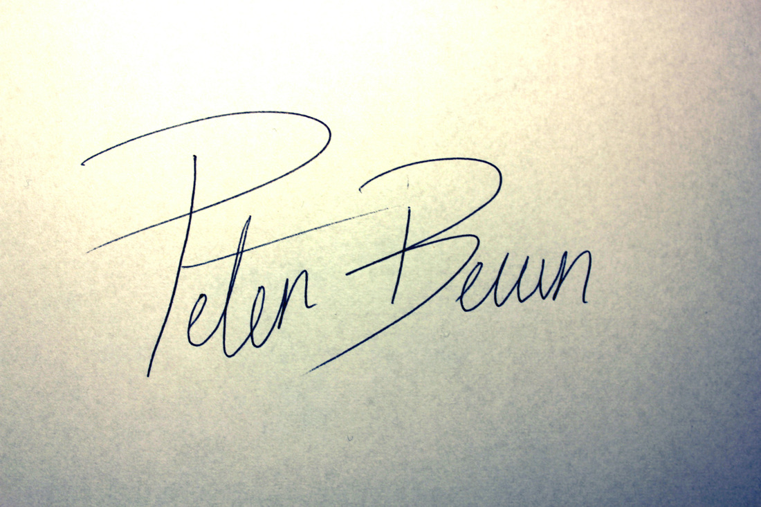 | This is a design which I have chosen out of my experiments as I believe it captures the eye. The lines used within the capital letters appear sharp and swift, giving the autograph a sense of movement and dramatic expression. The lettering is also conjoined so that the autograph appears as one whole and not multiple separate parts. I also feel that this autograph is very similar to my own everyday handwriting, so I feel as though the Autograph relates to me personally. |
| This autograph represents two sides of my personality. I feel that the capital letters relate to my humour and my social self, as they appear large and easy to digest. I also feel that the much lower case letters relate to my content quiet side as they appear much smaller and less dramatic than capital letters. The crossing of the letter "t" has been done effectively as it shares another purpose within the body of the letter "P" and the Capital "B" brings a strong sense of shape to the autograph, due to its loop located at its middle. | 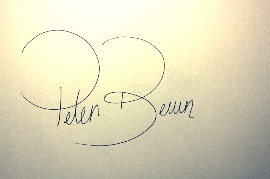 |
